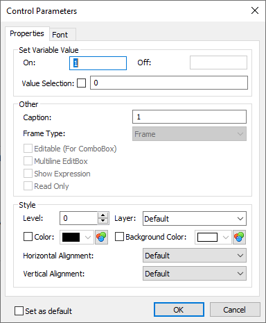
Parameters Dialog of Control |
  
|
Control parameters dialog contains following tabs:
•Properties
The content of this tab is described below.
•Font
This tab allows you to customize font of the selected control, similar to managing font of drawing detailing elements.
Moreover, there is the Set as default checkbox located at the bottom of the dialog regardless of the active tab. If you enable this checkbox, style and font parameters set for the selected control will be applied as defaults for all new controls created in future.
Properties

The default value of the Level parameter is "0", the parameter Layer" – "Main, the font parameters – By default.
The general parameter "Priority" is assigned automatically in the process of control element creation, reflecting the order of creation: the first control is assigned priority "0", next – "1", etc.
Besides the general system parameters, control elements have a set of additional parameters:
Caption (the text displayed on the control);
Color of characters (in the cases of "Frame" and "Preview" – the color of the frame strokes or the box background);
Background Color of the control element (for the element "Group Box" – the background color under the group name);
Vertical Alignment.
The two latter parameters define the caption text position with respect to the control element boundaries.
Some of the above-mentioned parameters are omitted in certain control elements. For example, the "Button" control omits the parameter "Background Color", while the "Group Box" does not require the parameter "Vertical Alignment", since the group name is always positioned along the top boundary. Note that, when defining parameters of a particular control element, only its relevant parameters will be accessible in the "Control Parameters" dialog box.
Some control elements also have their own specific parameters:
Frame:
Frame Type: frame or rectangle.
Edit Box:
Multiline EditBox – used for text variables only. Permits entering multiple lines.
Show Expression. This parameter affects custom dialogs when using variables. Usually, names of the variables are not displayed in the dialog boxes, when such variables or expressions are used as parameters of the fragments being inserted into assemblies. This option outputs name of a variable in edit fields of the dialog boxes. At the same time variable’s value or expression is displayed nearby.
Read Only. When this flag is turned on, the editor will work in a regime “read only”, i.e., in the Edit Box field the value of the connected to this field variable will be shown but this value will not be possible to modify.
Combo Box:
Editable – allows direct input of variable values without selecting from the list.
Value Selection. Option is used for binding external variables between each other. For example to select the thread pitch from list, according to the thread diameter, automatically. If the option is not activated, the thread pitch will not change according to diameter.
Check Box:
On – defines the value assigned to the variable when the box is checked;
Off – the value assigned to the variable when the box is cleared.
Radio Button:
On - defines the value to assign to the variable when switched on.
In the further description of the controls, only the elements will be mentioned that are specific to this control element.